Supplement Success Solutions (S3) is a comprehensive partner for dietary supplement brands, offering expertise in compliance, product development, and quality assurance. Built from the ground up in two months, this project delivered a full brand identity and website designed to communicate precision, professionalism, and trust.
→ Visit SiteScope
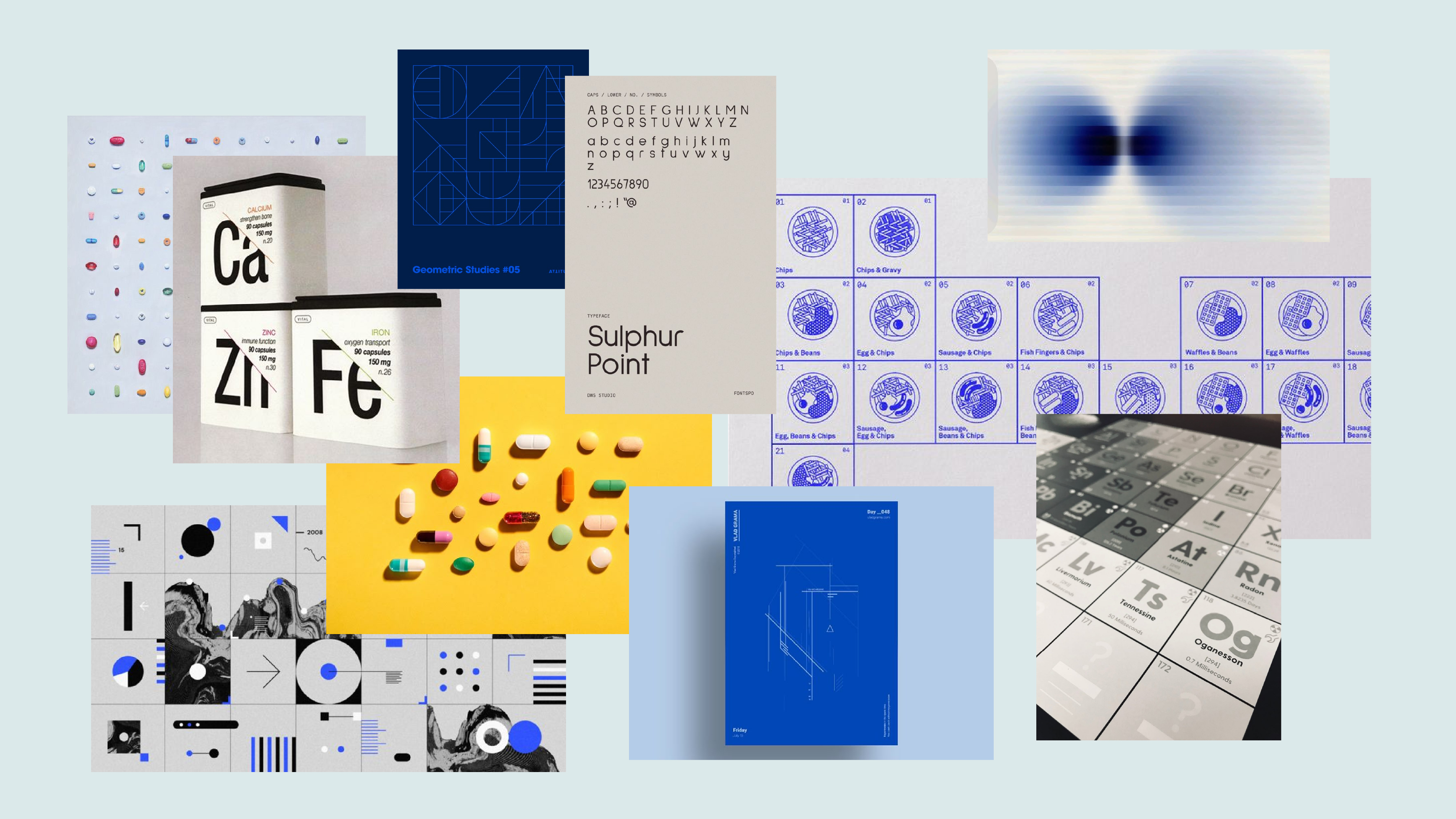
Tools
The Brief
Building a Brand from a Blank Page
S3 came to this project with a clear value proposition but no visual language to match it. As a compliance and product development partner for supplement brands, they needed an identity that communicated precision, expertise, and credibility without feeling clinical or inaccessible.
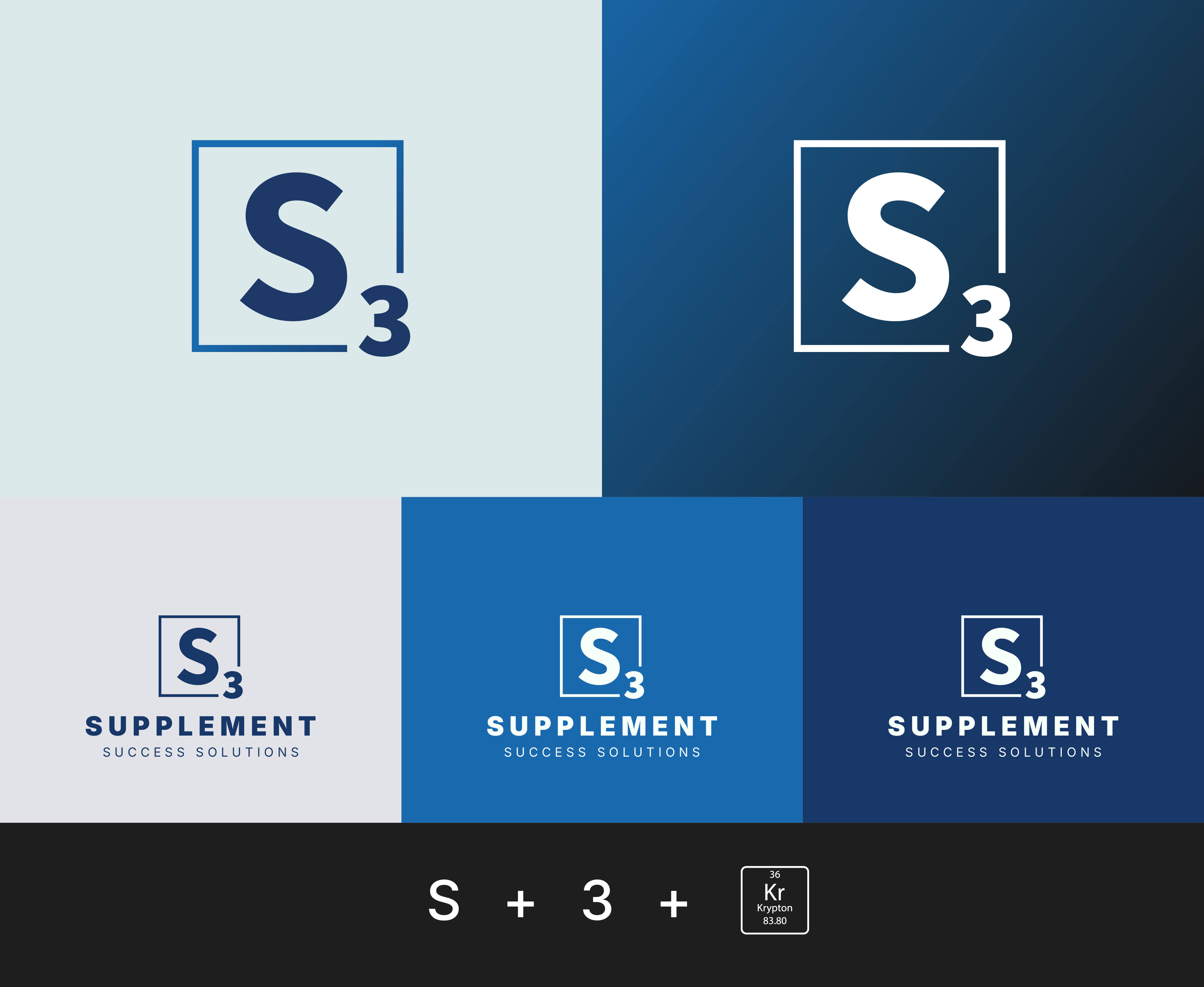
Logo Design
The Logo
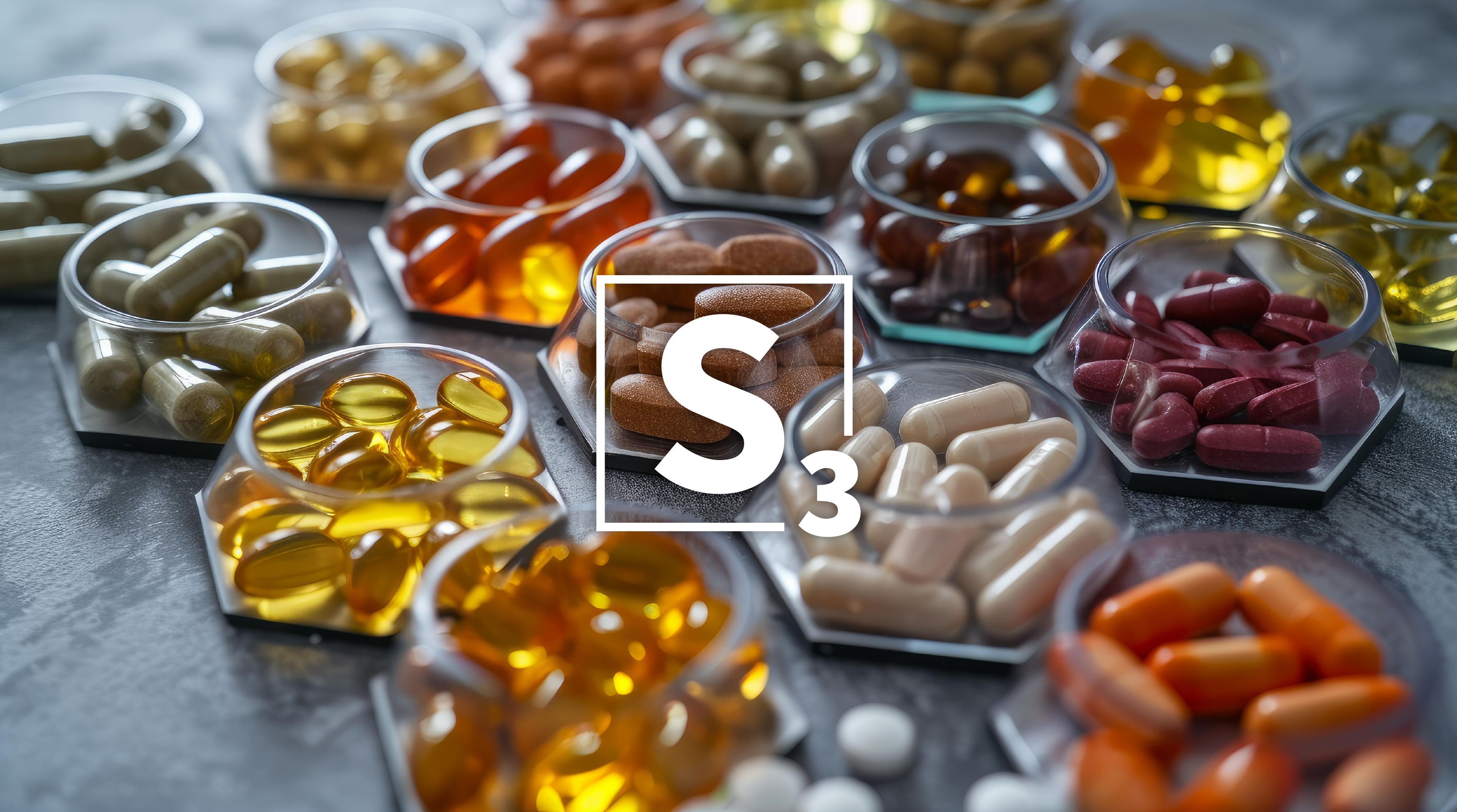
The logo draws from the visual language of the periodic table: each element represented by a letter inside a square box, a universal symbol for the foundational building blocks of science. The "S" sits centered in a clean square frame, with "3" positioned at the lower right, creating an immediate visual shorthand that communicates both the brand name and its scientific authority.
The design is deliberately minimal. Just form and function. This restraint was intentional: in a category where competitors often lean into complex iconography, S3's mark stands out precisely because it's confident enough to keep it simple. It scales cleanly from a business card to a website header, and reads just as clearly in reverse on dark backgrounds as it does in the primary navy.
Color System
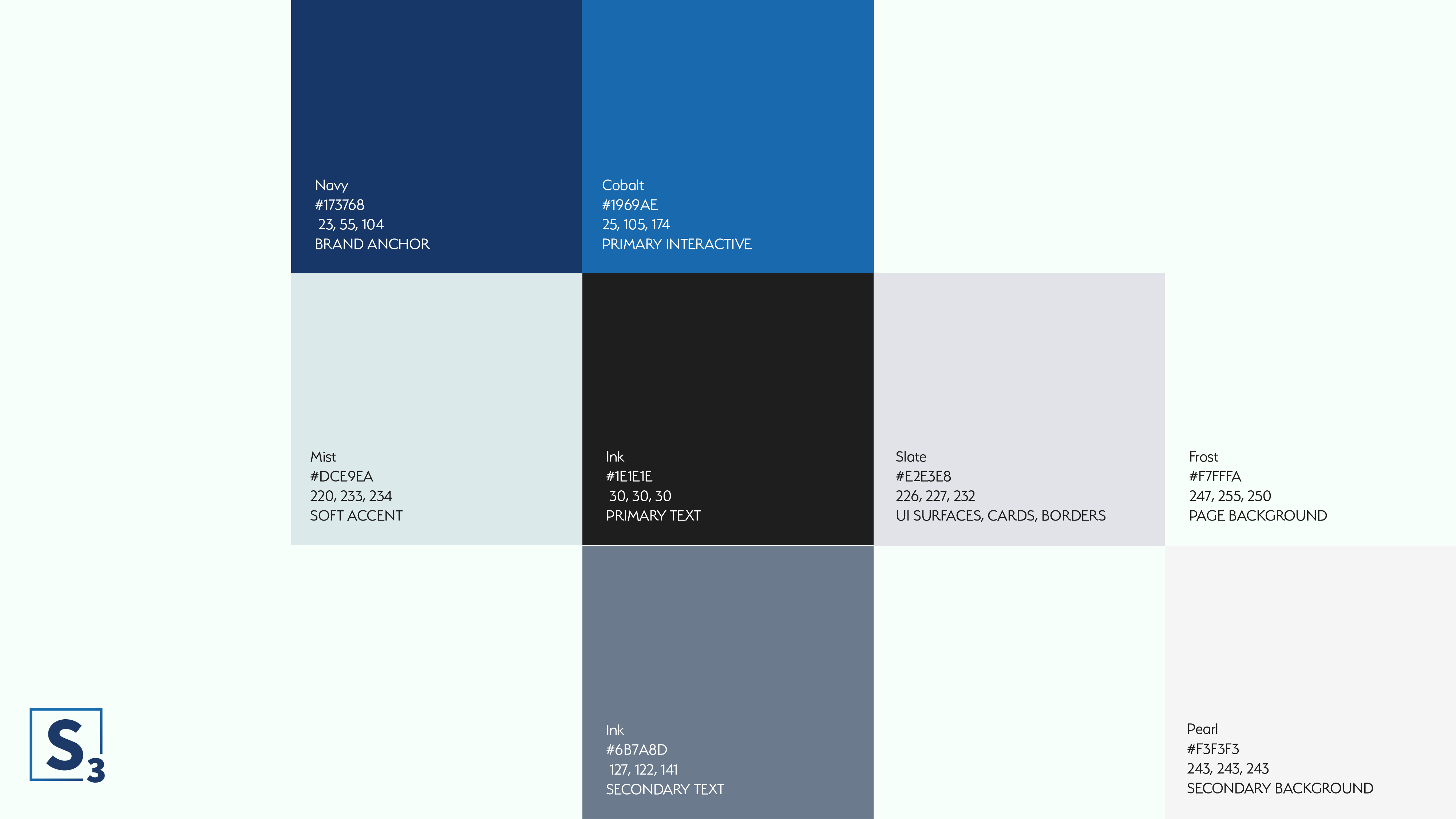
Color Palette
The S3 palette is built around a range of blues, from a deep navy anchor to lighter, more accessible mid-tones. Blue was a deliberate choice: it communicates trust, credibility, and stability, exactly what a compliance-focused brand needs to signal at a glance.
Brand Applications
Consistent Across Every Touchpoint
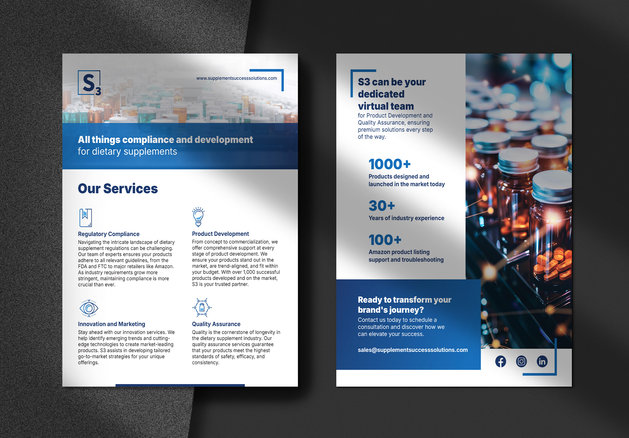
For S3, the brand system was built to hold up across every touchpoint a client or prospect might encounter, from a business card exchanged at a conference to a letterhead on a compliance document.
In a category where trust is the product, inconsistency is expensive. Every piece of collateral was built to the same standard: precise, professional, and consistent at every touchpoint.
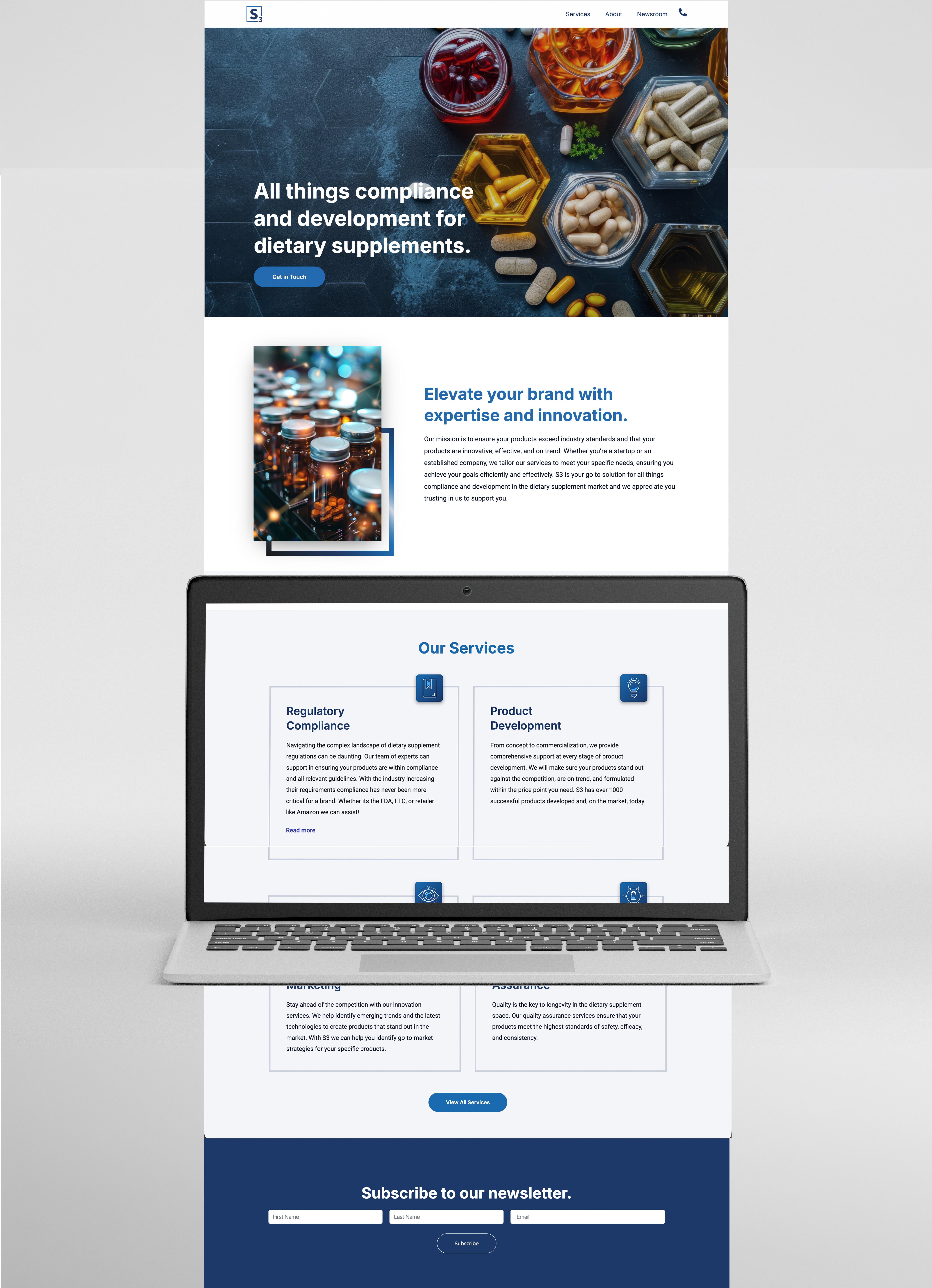
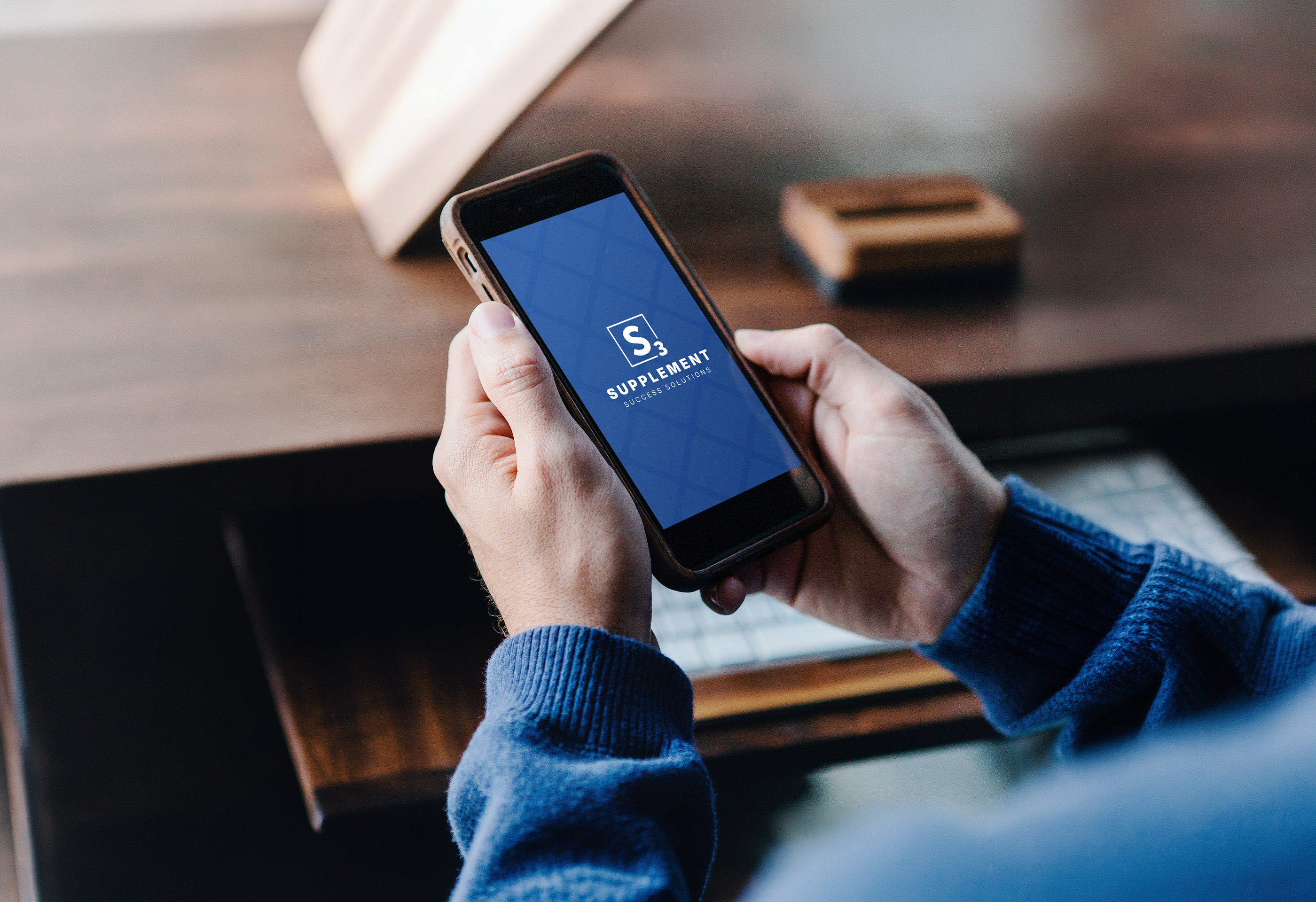
Digital Presence
Taking the Brand Digital
With the brand system defined, the final phase was taking it live. The S3 website was built in WordPress with Elementor, translating the identity into a fully responsive digital experience designed to convert prospective supplement brands into clients from the first scroll.
Page structure prioritized clarity and credibility: leading with what S3 does, quickly establishing why they're qualified to do it, and giving every visitor a clear path to reach out. Service pages were built to be scannable without sacrificing depth.