Qumba was an internal wellness brand developed by Lief Labs. The work spanned brand strategy, visual identity, packaging, campaign execution, and digital presence, three years of building an internal brand from the ground up.
Scope
Tools
Original Identity
Where It All Started
Qumba launched as a focused, single-product brand, a kombucha powder line anchored by a bold circular badge mark. The original identity leaned into confidence and clarity: one product, one purpose, one unambiguous visual statement that read well on packaging and stood out on shelves.
The circular lockup with "QUMBA / KOMBUCHA POWDER" became the backbone of early packaging and brand touchpoints.
Over three years, the scope expanded well beyond initial expectations. What started as a single-product kombucha powder brand grew into a multi-product wellness line spanning three product lines and multiple SKUs, from identity and packaging into campaign strategy and execution, Shopify storefront design, Amazon store management, email marketing, customer feedback loops, and social media content.
.jpg)
The Evolution
Why We Redesigned the Mark
The original badge mark did exactly what it was supposed to do: anchor a single product with confidence. But as the product line expanded, it started working against us. A mark built for one SKU doesn't flex across three different product stories, and a rigid circular lockup made it nearly impossible to build a cohesive multi-product packaging system. The decision to refresh wasn't about what was wrong with the original; it was about what the brand was becoming.
-
1
Audit the system. Identified everywhere the original mark broke down: tight label layouts, digital environments, co-branding contexts, small sizes.
-
2
Explore mark directions. Developed multiple logo directions ranging from full rebrands to refined evolutions. Kept the Q, explored how to build a unique letterform with a natural reference baked in.
-
3
Build the system, not just the logo. Designed the mark to work within a full color-coded packaging system from the start: each product category mapped to a distinct palette while the mark held the family together.
-
4
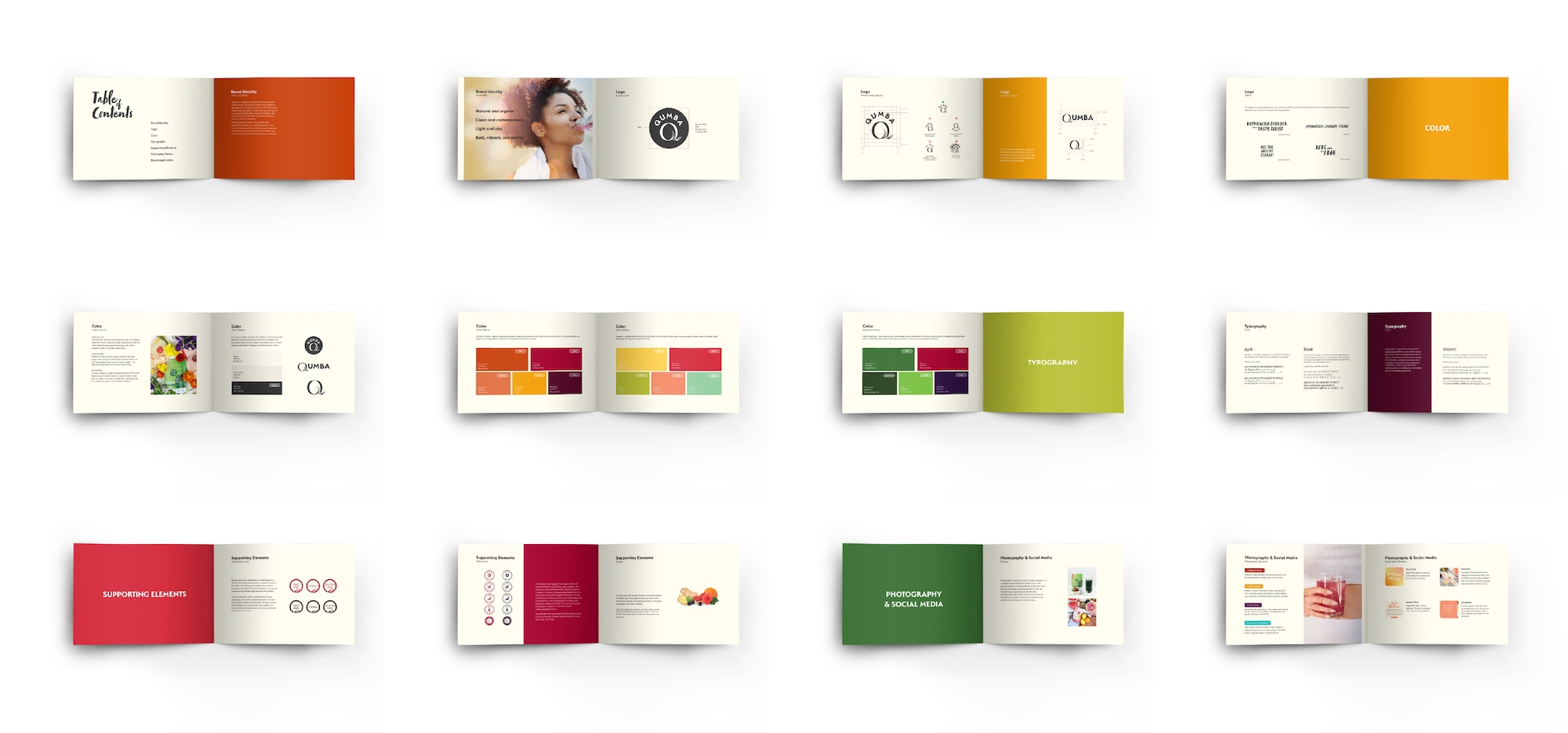
Codify everything. Produced a comprehensive brand guide covering logo construction, palette, typography, photography direction, and supporting elements, so future applications could scale without my direct involvement.
Brand Refresh
A System Built to Grow
As Qumba expanded into Green Superfood, Hydration, and beyond, the brand needed a mark and system flexible enough to carry a full product range. The refreshed identity integrates a leaf into the stylized "Q", a quiet nod to vitality that holds across colorways, product categories, and applications.
Applied to packaging, the new mark anchors a bold, flavor-coded system where each product carries its own color story while remaining unmistakably Qumba. The comprehensive brand guide codified everything: logo construction, palette, typography, supporting elements, and photography direction, giving the brand the foundation to grow without losing the clarity at its core.
.jpg)
Campaign & Social
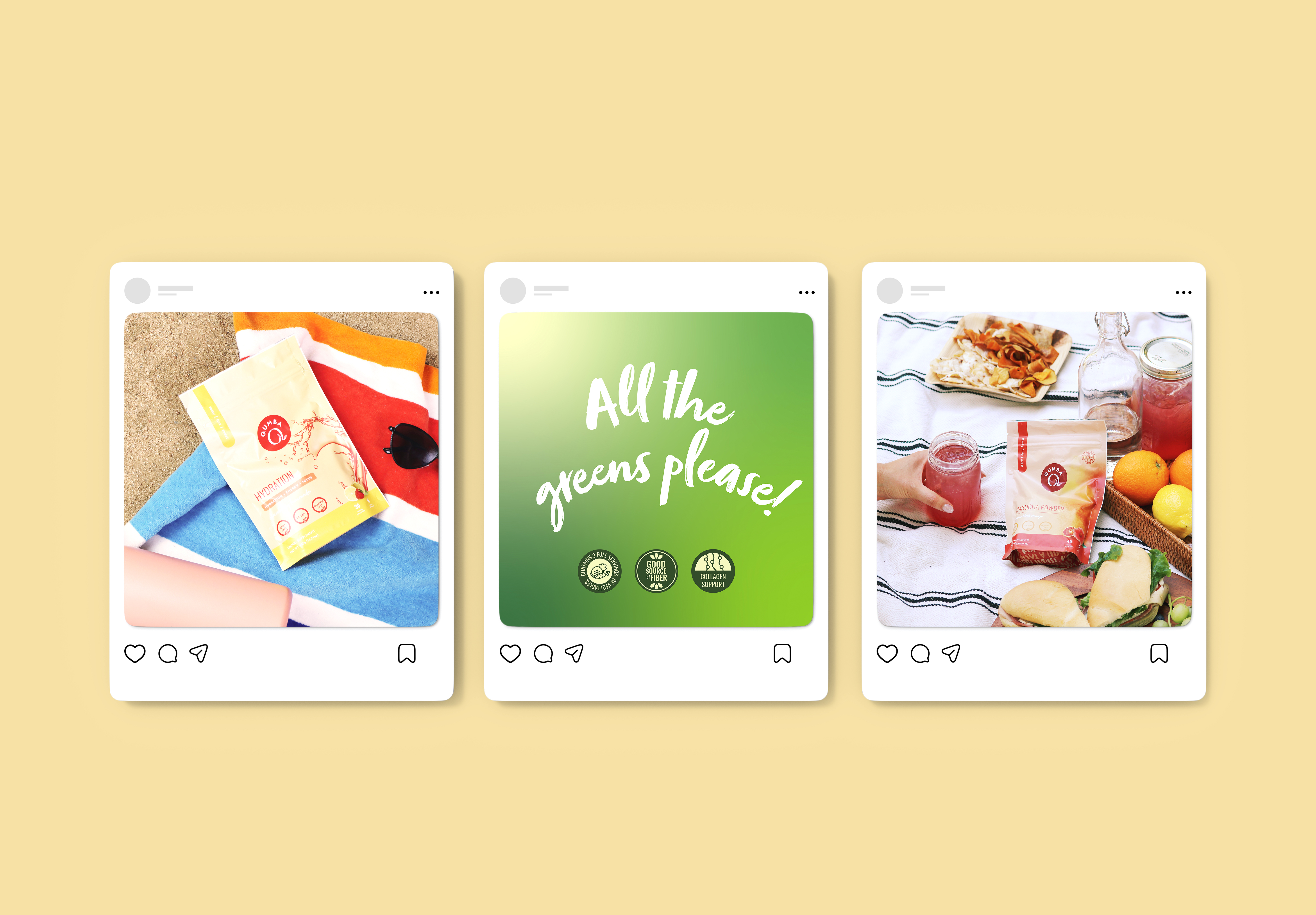
Strategy, Content & Community
Beyond the visual identity, I led campaign strategy and execution across Qumba's marketing channels, developing content pillars, managing the social calendar, and running 240+ email campaigns in Mailchimp to a list that grew to over 17,000 subscribers at its peak.
On social, I created branded templates for feed posts and stories to maintain consistency across product launches, seasonal moments, and educational content. The email program spanned everything from holiday promotions and product launches to educational content and customer feedback surveys, delivering nearly 3 million emails over the life of the brand. Customer responses fed directly into product development conversations, a feedback loop I helped build and maintain throughout.
Digital Commerce
Shopify, Amazon & Beyond
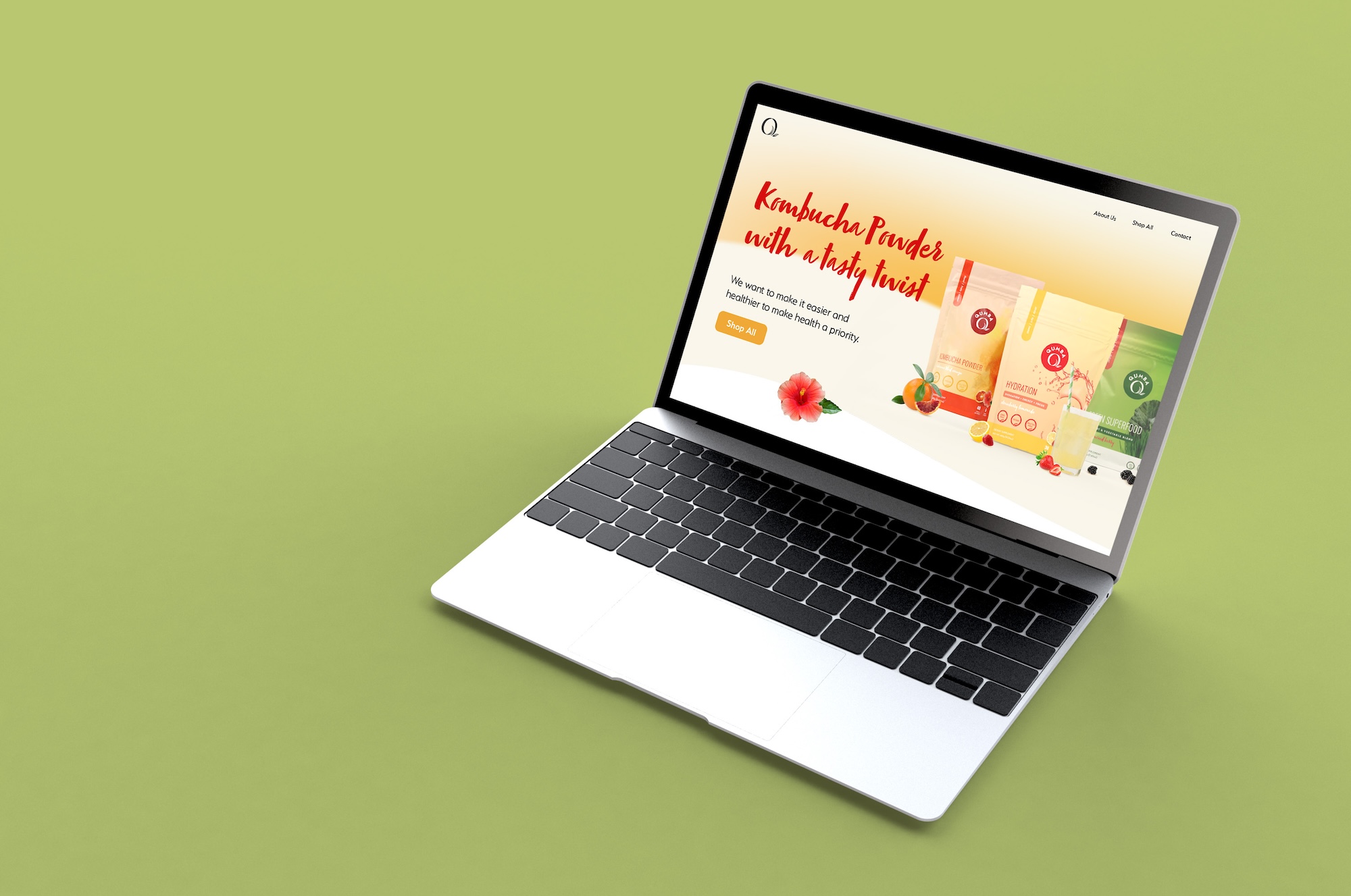
I designed and managed Qumba's digital storefront on Shopify, handling everything from page design and product photography layout to navigation structure and conversion-focused copy. The goal was a site that felt as polished as the packaging and as clear as the brand it represented.
Alongside the Shopify store, I built and maintained Qumba's Amazon presence, designing the brand storefront, optimizing product listings, and creating A+ content that carried the visual identity into the marketplace. Both channels stayed in sync with new launches and seasonal campaigns.
Outcomes
Qumba was the kind of project that doesn't come around often: a genuine zero-to-one build across every touchpoint a brand can have. What started as a logo and a label grew into a fully realized brand ecosystem with its own voice, visual language, customer base, and market presence. Building something from nothing, and then watching it grow into something real, is what this work is all about. Qumba closed in September 2024 when Lief Labs made the decision to wind down the brand, a business call, not a creative one.
What I Learned